.svg)

Next


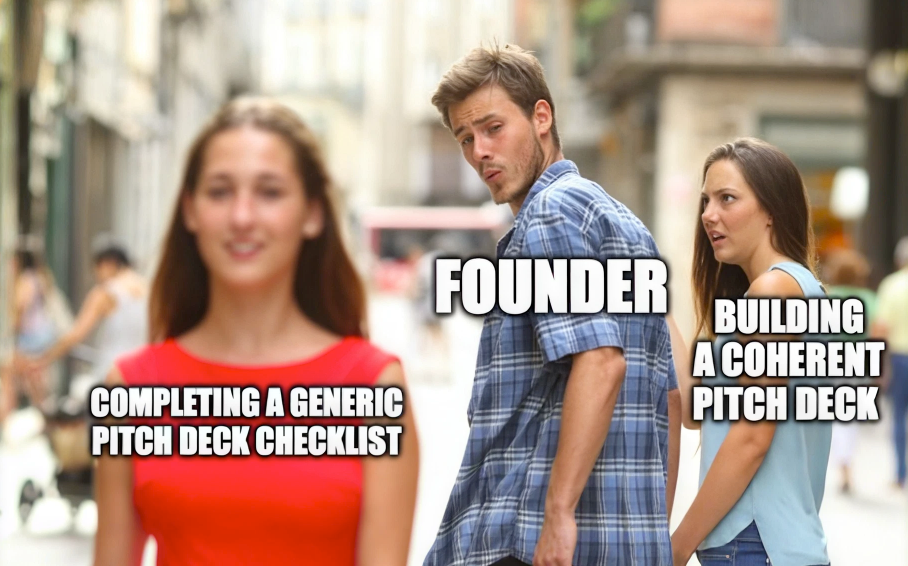
Every "what investors look for in a pitch deck" article says the same thing. TAM slide. Traction slide. Team slide. Ten to fifteen slides in the right order with the right numbers underlined twice. You've read it, you've probably already built it too, and I'll bet it's still not landing the way you hoped.
Here's the bit nobody tells you: investors aren't sitting there with your checklist open, ticking boxes. They're pattern-matching for coherence, mostly without realising they're doing it. And you never find out you failed that test, but rather you just get a polite "not the right fit for us right now" and move on to the next deck, no idea your content was actually fine and your brand gave you away.
I've been through this myself, and I've helped founders get ready for raises at every stage; seed through Series B. The thing that actually gets a deck flagged in an investor's head is almost never a missing slide. It's a deck that looks like three different companies stitched together. It's a hierarchy that makes the reader work to find your point. It's a deck so over-designed it feels like it's compensating for something, or so under-designed it feels like nobody could be bothered to finish it. None of that shows up as a note in the margin. It shows up as the gut feeling: “this isn't ready.”
You didn't plan for it to be one. Nobody sits down thinking "let's make sure our pitch deck design is on-brand". You're thinking "let's get the numbers right and the story straight." Fair enough. But the deck is the first piece of your company an investor spends real, undistracted time with. They spend twenty-plus minutes, slide by slide, quietly forming an opinion about how you think.
About 10 seconds after they hit the ‘Thank You’ slide, you can be sure that they will Google you. If your website looks like a different company to your deck, for example: different type, different colours, different voice entirely — that's not a footnote. That's the first data point in a conclusion they haven't said out loud yet: these people don't have their act together. Brand consistency in fundraising isn't a nice-to-have you bolt on once the content's done. For a lot of investors, it's the fastest proxy they've got for how you operate when nobody's watching.
I'm not talking about whether your deck has a nice colour palette. Brand coherence here means your visual choices, your hierarchy, and your narrative all agree with each other. A few of the things I look for when I'm going through a founder's deck before it goes out:
None of this is about slide count or slide order. It's whether the deck holds together as one thing. This is what's actually being judged, whether the investor would ever call it that or not.
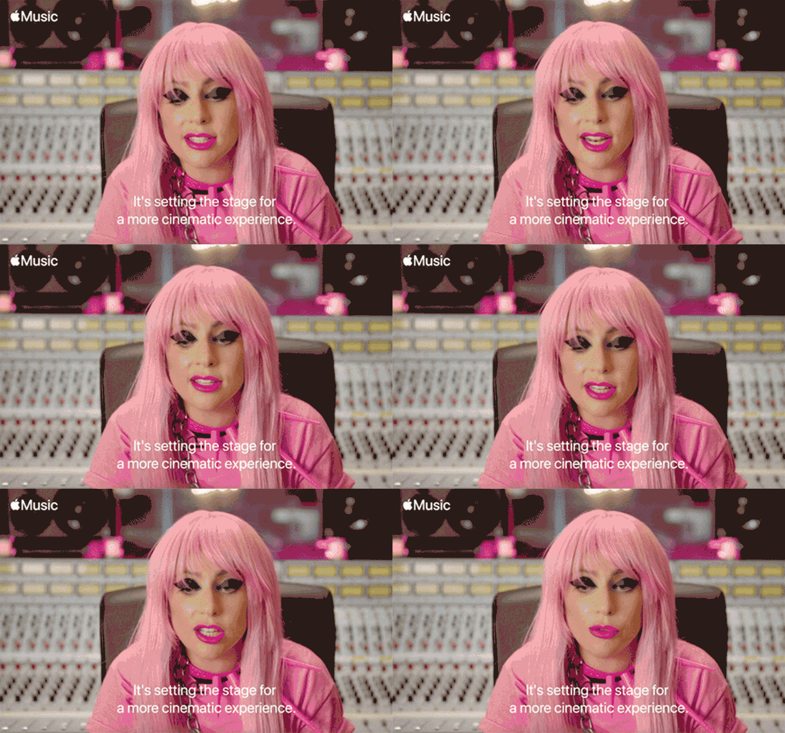
I went through this exact thing building MathforMoney, a maths and financial literacy app for kids, through the CVLabs incubation programme. What changed how I think about decks wasn't the slide template… it was realising the story had to flex completely depending on who was in the room, while the brand underneath stayed exactly the same.
Pitching to banks, MathforMoney was FinTech: a way to build loan-risk profiles from spending and saving behaviour tracked from age six, positioned as the first bank account a kid ever holds and surfacing this as the kind of early relationship that makes people stick with the bank their parents opened for them. Pitching to schools, it flipped to EdTech: an algorithm built around the psychology of maths anxiety, calibrated to keep kids challenged without tipping them into hating the subject, with word problems that taught real financial literacy — a subject OECD PISA data consistently shows a meaningful chunk of 15-year-olds worldwide still don't reach baseline proficiency in. Pitching the non-profit angle, it became a way to sponsor maths pocket money for underprivileged kids, tying financial literacy directly to a way out of poverty.

Same product. Same brand. Three completely different stories. And this is where founders get "brand consistency" backwards. They hear it and assume it means one deck, one story, repeated everywhere. It doesn't. The narrative should change with the audience. What can't change is the visual and tonal system underneath it, the thing that makes your EdTech deck and your FinTech deck still unmistakably the same company. That's what lets you flex the story without ever looking like you're making it up as you go.
It's also, honestly, how a very early-stage kids' app held its own in a room against far more technically complex competitors. MathforMoney was earlier in its journey than almost anything else being pitched that round. What made investors take it seriously anyway was that it didn't look early. The brand did work the product roadmap hadn't caught up to yet and years later, people still ask to use that deck as a reference!
A few startup pitch deck mistakes that have nothing to do with formatting:
Burying the team. Most founders treat the team slide as a formality near the end. For a lot of investors it's closer to the most important slide in the whole deck, because they're backing the people as much as the current version of the product, especially pre-Series A when the product's going to change shape more than once anyway. Slack is the case everyone reaches for: the founding team's original product, a game called Glitch, didn't work. Investors backed the team hard enough to fund the pivot anyway, and that bet became Slack. Nobody remembers Glitch. Everybody remembers backing the right people.
Assuming novelty is the pitch. Founders often work hard to prove they've invented something nobody's ever seen. News flash: pretty much everything's been done. That's a good thing as it means you're not stuck teaching your customer why they need you at all, because they already know. The real question is what sets you apart. Faster? Cheaper? Better team, better distribution? "Nobody's done this" is a much harder sell than most founders expect. "This works, and we do it better" is a story investors already know how to evaluate.
Trying to say everything. If your product's too hard to explain, no investor's going to do the work of untangling it, but rather they'll assume the confusion is yours, not theirs. Max three major points per slide. I know that's genuinely hard, because everything feels important. Trust me on this one: forcing yourself down to three is one of the clearest tests of whether you actually understand your own narrative, because it makes you decide which three points actually matter.
Stop asking "what slides do we need." Start asking "what does this deck reveal about how we think." Every inconsistency, every crowded slide, every mismatch between the deck and the website is a small, unintentional signal about how your company operates, and investors read those signals whether or not they'd ever call it a brand audit.
But here's the thing: the deck isn't a one-off test you pass or fail once and move on. It's just the first version of it you happened to notice. The next one is your data room. The follow-up email you send three days later. Whatever your website looks like the second time they check it, not just the first. Brand coherence doesn't clock out once the term sheet's signed either, because your next round, your first hires, your first bit of press all get measured against the same quiet question: does this still look like the company we backed. Fundraising just makes that question louder and more frequent than usual. It doesn't invent it.
The content checklist gets you in the room, once. Coherence is what gets you believed in every room after that.
Want a second pair of eyes on your deck before it goes out? We audit decks for exactly this. Get in touch and we'll tell you what it's actually saying before you send it.
Related blogs
